Written by: Rishea Middlebrooks MSHI, CAPM
The famous adage “A picture is worth a thousand words” is greatly attributed to many aspects of life, including data. How you visualize data determines how it is perceived to the intended audience and could make or break a decision process. Compare your techniques to the ten best practices below to see where you can take your data visualization capabilities to the next level!
Presentation Overview 

The volume of data we collect in our businesses is growing at rates that are hard even to quantify. As more information about your initiatives and projects is available, you can use these data to increase the efficacy of your projects. Ashley Cohen discussed the following concepts within the context of data visualization that have changed how we think about our world:
- Definition of data visualization
- Ten best practices
- Five ways to understand and interrogate your data effectively
Takeaways
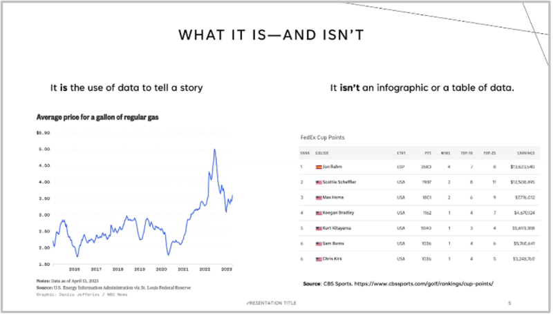
What is data visualization? The compilation of multiple data points to tell a story to the intended audience or to make a more informed decision. Data visualization is not an infographic or a table of data.
Ten best practices
- Simplicity (Three/3)
- Focus on the 3 things needed to make a decision.
- Right graphs
- Visualize change over time or data comparisons quantitatively (i.e., replacing pie graphs with bar graphs wherever possible). Line graphs, bar graphs and choropleth graphs are the most effective graphs in most settings.
- Design
- Data visualizations should be easily navigable, appropriate for the topic, consistent and well formatted. Don’t be afraid of white space. Use that to separate the degree variance of your data.
- Color and shape
- Color and shape schemes should be used to differentiate and compare differential values while also being friendly to color-deficient audiences (ex: shy away from red or green). Shapes should not be used to quantify data.
- Context
- Be sure to list titles, axis labels, data point labels and sources. Do not over label your visualization.
- Relevance
- Highlight impact points and visualize data latency where appropriate.
- Audience
- Take time to investigate your audience to better tailor your data visualization.
- Story
- Assess if the data you’re visualizing portrays the story you want to tell accurately.
- Visual cues
- Use visual cues where necessary to make data more impactful.
- Accessibility
- Design your data so that anyone can use and comprehend it.
Next Event
Join us at the next PMI Atlanta Chapter Healthcare forum on May 19, 2023
Register at www.pmiatlanta.org/events/event-calendar
Event Pictures